Last week's assignment was to do an original drawing in the artist's style. Here is my "Blue Dog x 3".
Friday, April 17, 2015
More Drinking and Drawing
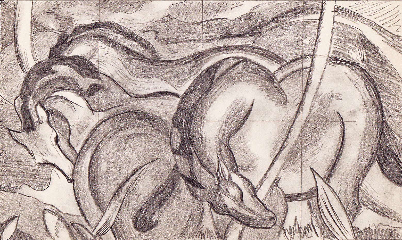
I'm a bit behind in my documentation. A couple of weeks ago, our assignment in Drinking and Drawing was to draw another work by our chosen artist, but let our own style creep in as well. Here's my version of Franz Marc's "Tower of Blue Horses."
This was especially fun because I bought some new pastels. I haven't drawn anything in ages. Stay tuned for self portraits.
Friday, April 3, 2015
Blending and Drawing
Last week's Drinking and Drawing class assignment was to draw a work by another artist. I chose Franz Marc's piece, "Blue Horses". Here is my drawing:
I've also continued my Blender tutorials. I just finished the 301 class. It added more keyboard commands and how to snap to grid. Here's the exercise at the end:
In other news, I added more memory to my computer, and I can now see parts of mesh buildings that were invisible before. There are no more random textures in the water either. Before and after pictures of a mesh building on campus:
Thursday, April 2, 2015
Artist Books
I thought that today, I would post some pictures of my artist books. The first one is "Shoes United". The text is a poem by Mike Buil. It's about a man who hits one of his shoes with a newspaper to keep it off the table. Chased across the room, "the shoe gave the signal a shoe gives when in trouble." An army of shoes hears the call and comes to the first shoe's rescue. They covered the man "like ants on a pink picnic popsicle."
The poem itself contains lots of wordplay, so the physical book had to as well. It's printed using the font, Footlight, on Arches paper. The paper is folded in such a way that it opens on three sides, so one reads the beginning, turns the book over and reads back the other way, then turns the book over again to read the ending. It has a shoe lace clasp. Little feet on the covers indicate the direction in which to read.
For illustrations, I photographed my shoes and the author's shoes, and turned them into line drawings in PhotoShop. Then I made polymer plates from the result. Here is a photo of my press when I was printing one color of the illustrations.
The next one is part of a series of postcards from places in literature. This one is a tunnel book, which means that it is made in layers, that when pulled out, form a tunnel. In "Greetings from Innsmouth", the tunnel is the bellows of the camera body that makes up its case. The vintage camera was not rare, and the bellows had crumbled into dust, so don't worry, no cameras were wantonly destroyed to make this book!
"Rags to Riches" was part of the "Valley of the Sunflowers" project. Local artists grew sunflowers in an urban vacant lot, and made paper from the plant fiber. This paper was given to area artists who created something on the theme of sustainability with it, and the resulting work was shown in a local gallery. My project was a letterpress printed accordion book. The covers are original cyanotypes made by laying wild flowers on treated paper.
My imprint is Pyrrhic Press, which has a Facebook page: https://www.facebook.com/PyrrhicPress/timeline?ref=page_internal
I also make books as part of a collective, but that would be revealing my secret identity. :)
The poem itself contains lots of wordplay, so the physical book had to as well. It's printed using the font, Footlight, on Arches paper. The paper is folded in such a way that it opens on three sides, so one reads the beginning, turns the book over and reads back the other way, then turns the book over again to read the ending. It has a shoe lace clasp. Little feet on the covers indicate the direction in which to read.
For illustrations, I photographed my shoes and the author's shoes, and turned them into line drawings in PhotoShop. Then I made polymer plates from the result. Here is a photo of my press when I was printing one color of the illustrations.
The next one is part of a series of postcards from places in literature. This one is a tunnel book, which means that it is made in layers, that when pulled out, form a tunnel. In "Greetings from Innsmouth", the tunnel is the bellows of the camera body that makes up its case. The vintage camera was not rare, and the bellows had crumbled into dust, so don't worry, no cameras were wantonly destroyed to make this book!
The text was an old poem that goes in a circle, beginning and ending with the same line, combined with a call to make paper out of sustainable resources such as cotton or kenaf, rather than trees. Before 1830 paper was made primarily out of cotton, and it is generally still supple and white. Fiber from trees is inherently more acidic. For example, a modern newspaper becomes discolored after only a few hours in the sun.
Here is a photo showing the lovely golden color and texture of the sunflower paper. The illustration on the title page is a real letterpress dingbat, cast in lead, and letterpress printed. It is a reference to my paper mill in Second Life.
I also make books as part of a collective, but that would be revealing my secret identity. :)
Subscribe to:
Comments (Atom)


